Project Overview
Summary
I redesigned the VPAL websited, focusing on the Home and What We Do pages. I also conducted a manual and automated accessibility audit, and consulted on accessibile alternatives for a visual asset.
Team & Timeline
1.5 months start to finish, with a 4-person team working remotely.
Responsabilities
Tools
- CSS
- OpenScholar
- Figma
- Adobe Illustrator
- JavaScript
Outcome
A new visual identify for the VPAL website that better match the university's core brand, and included a "What We Do" page that better communicated the department's role and value.
Problem and Context
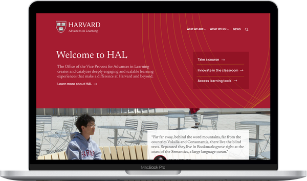
In 2021, the Harvard Office of the Vice Provost for Advances in Learning (VPAL) rebranded their print material to lean more into the traditional Harvard crimson palette. In this project, I applied their new visual identity to their existing website.
What I did
Experience and Visual Design
I used low fidelity wireframes to establish the layout of new content, and took inspiration from print guidelines for the new visual identity.
I primarily focused on the redesign of two pages: the home page and a new "What We Do" page. The Home page involved very few content changes, so I went directly into high fidelity wireframing. Here, I mainly iterated over the representation of the Harvard shield on the department's logo, and the student testimonials.
I used the already established guidelines print guidelines and inspiration, to maintain visual consistency. The wireframes also used the acronym HAL for Harvard Advances in Learning, a rebranding that the department momentarily considered.

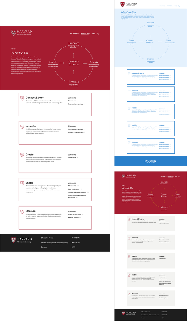
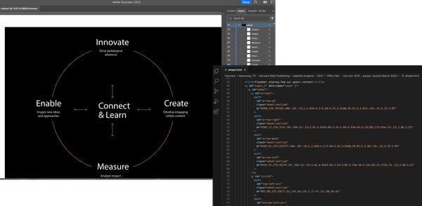
"What We Do" involved entirely new content, including a flywheel diagram that represented the five core objectives of the department. Thus I began by establishing the layout of this new content with low fidelity wireframes, before moving into the visual design.
For secondary pages, I focused on creating reusable patterns.
Other pages of the website did not require new content nor major changes. Therefore I only created one additional wireframe to establish the remaining reusable design patterns.

Design Engineering
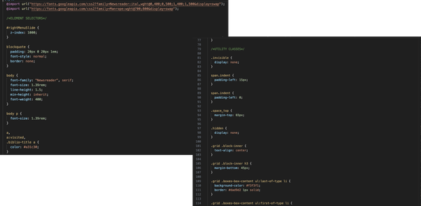
Next I edited the CSS of the website.
VPAL had an existing website built on a content management system (CMS) called OpenScholar. The project team added any new content required, and I used CSS and JavaScript to modify the look of the website.
Digital Accessibility Design
Part of the process involved identifying accessible alternatives.
The VPAL team wanted a clickable flywheel image that represented their 5 core capabilities. This flywheel image only existed as a PNG asset, which was not clickable nor easily accessible for screen readers. I used Illustrator and a text editor to create a clickable SVG version of the image. I'd done something similar in the past, and wrote a blog post where I described the process of making and testing an accessible SVG.
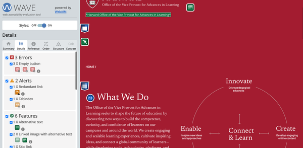
I also conducted accessibility audits using the Wave and Site Improve Chrome Extensions to assure the site met with AA guidelines.
While I fixed the errors I could, some errors were platform issues that I could not solve. The OpenScholar platform has various accessibility issues, including empty buttons. At the time of this project, I was part of a team that was working on finding solutions for this problems, including finding a content management alternative for departmental websites, and working with Open Scholar to make changes to their platform.
Outcome
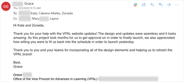
The new VPAL website launched in March 2022 after a few sets of successful departmental approvals. The project manager for the website redesign, and I both heard back from VPAL shortly after launch. They thanked us for the website "seamless updates" and said the website looked amazing.