Project Overview
Summary
I redesigned a private Community Website for Harvard Institute for Learning in Retirement (HILR), focusing on information architecture and experience design. During the project, I also conducted a user survey and a comparative tree test.
Outcome
HILR Community members reported having an easier time finding courses and getting help with remote learning tools.
Responsabilities
Discovery Research , Information Architecture , Experience Design , Website Theming
Team & Timeline
Year:
Duration: 7 months start to finish
Team: 2 website owners, 1 project manager, 1 UX Designer/Researcher (me)
Tools
- Sketch
- InVision
- OpenScholar
- Optimal Workshop
- Qualtrics
- CSS
- JavaScript
Problem and Context
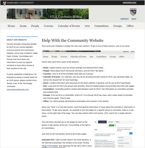
HILR offers learning opportunities for retirees. Once someone signs up for the program, they get access to a private Community Website, where they can access courses and community resources. When COVID-19 led HILR to work remotely, the website became a primary tool for communication. Unfortunately, due to decentralized content ownership, this site had become difficult to maintain and navigate, so difficult that the staff had created a page that explained the navigation.
What I did
Discovery Research
To give members of the community a voice and identify critical concerns, I conducted a survey.
We received 47 survey responses in one week, which helped us discover that members struggled to:
- Use the people directory of the site to find other members
- Navigate the digital course catalog
“Thanks for asking! I've always had trouble with the search function on member bios. It's hard for me to narrow down the responses - I always get too many names.”
HILR Survey Participant
“Having tabs for the four days [of courses] makes it impossible to search for a course--by title keyword or study group leader name, for example--except by doing it four times, one on each tab.”
HILR Survey Participant
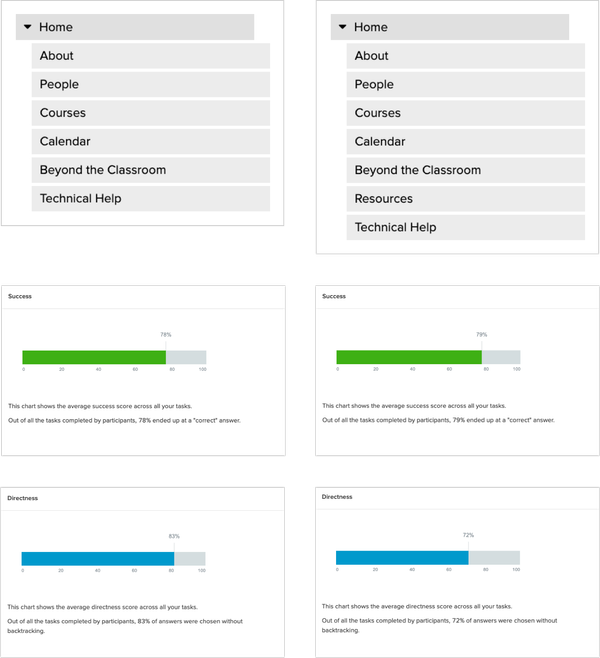
Information Architecture
After some discussion and a card sort, we decided to include 7 pages on the main menu:
- About
- People
- Courses
- Calendar
- Beyond the Classroom
- Resources
- Technical Help

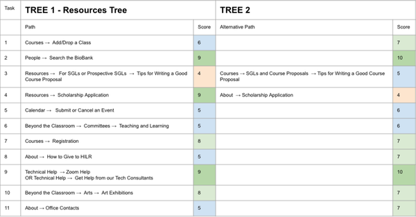
Concerned that “Resources” did not provide enough context, I suggested that we did a comparative tree test with two navigational structures: one that spread resource articles across the site, and one that used "Resources" as a menu item.
We had a total of 59 participants on the test, 29 in one tree and 30 in another. While on a high level, the trees had similar directness and success rates, at an individual level, most tasks on the tree with the word “Resources” had lower success rates. In a scale of 1 to 10, with 10 being the highest score, the tree with the word Resources had the most tasks that scored 5 or lower. As a result, we eliminated the Resources page.
“The ‘Resources’ tab kept confusing me. I kept thinking it would offer links to internal resources at HILR but that doesn't seem to be its function.”
Tree Test Participant
Experience Design
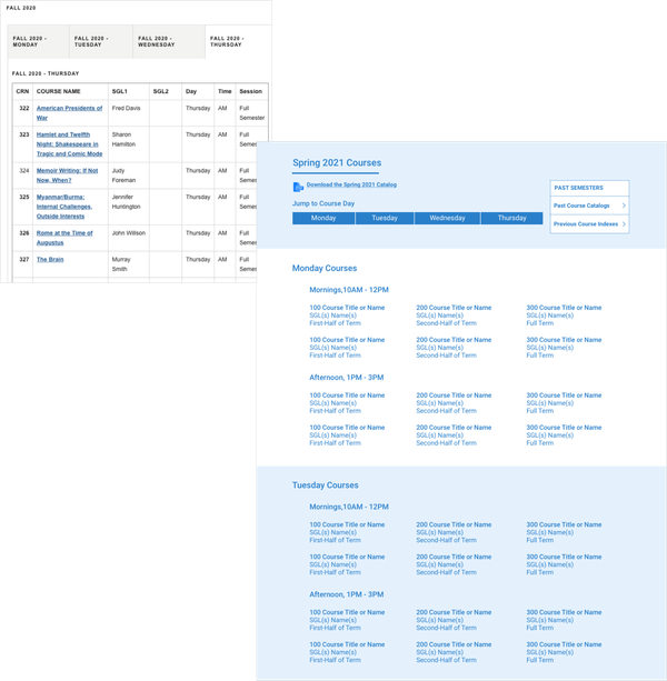
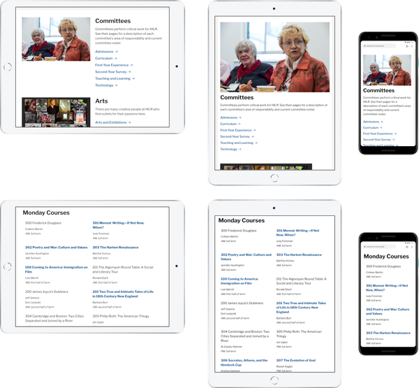
I made the course catalog more browsable by laying out courses in a grid.
I made the course catalog more browsable by laying out courses in a grid.
On the original website, the course catalog used tabs to divide classes by day, making browsing difficult. To solve this issue, I listed the courses in a grid layout and created anchor links so members could quickly jump from one course day to the next.
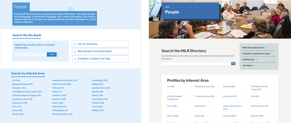
On the People, I surfaced filtering options to make it easier to narrow down directory search results.
Member profiles were tagged by interest, allowing site visitors to discover members with similar passions. On the original site, these filters appeared away from the website visitor’s view. I fixed this issue by placing them in the center of the page, right below the search bar.
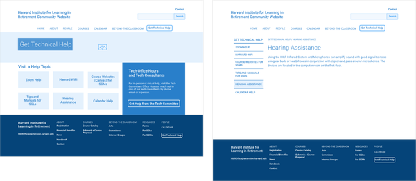
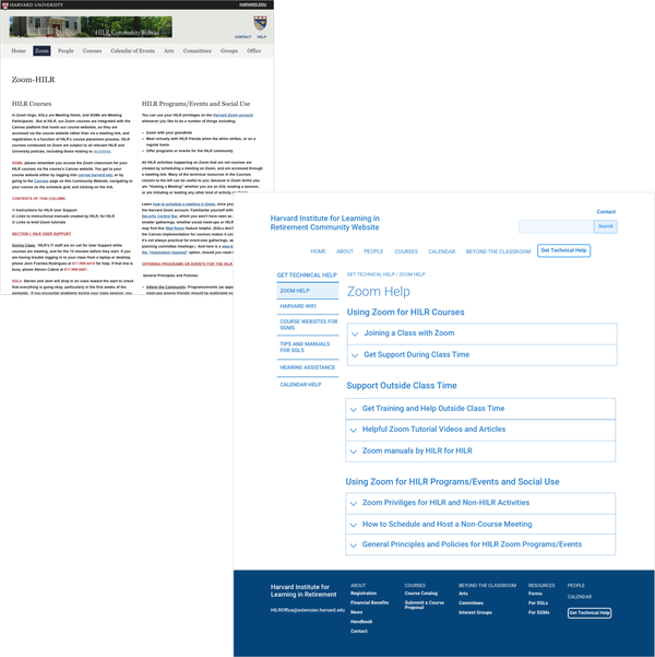
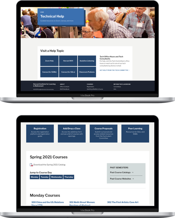
One of my main goals became reorganizing and redesigning the Tech Help page.
While not mentioned in the survey, according to HILR staff, some older community members had difficulties with the technologies for accessing Harvard resources. The Zoom Help page was particularly challenging. The original page consisted of two columns of text, with little use of headings and poor scannability. I used accordions to divide the page into different help topics and increase scannability.
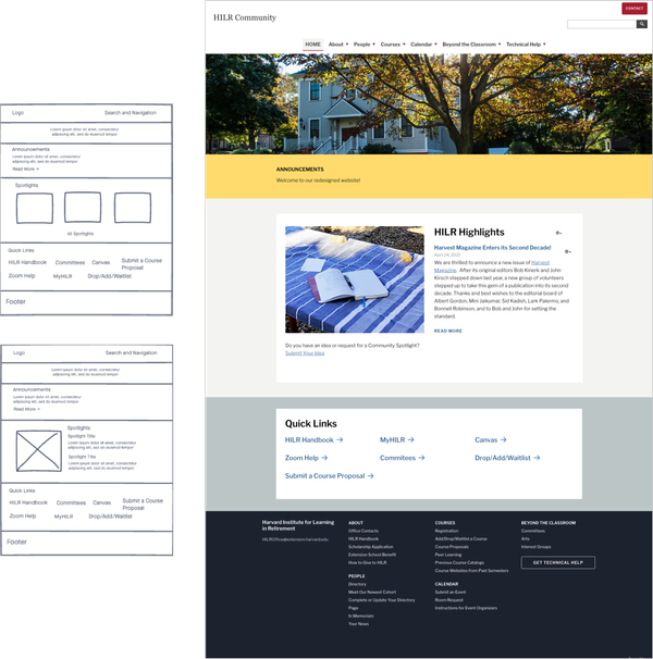
To better understand goals for the Homepage, I did a live sketching session using InVision Freehand, during which I asked about their needs.
Because the community site was private, members did not get to it through organic search. Therefore the Homepage needed to be both a place where members could see what was happening in the community and quickly access what they needed next. After some discussion, I suggested creating a “Quick Links” section, which the HILR team could customize per current community needs. They loved the idea. “I didn’t realize we needed Quick Links,” they said.
Website Theming
The project plan allocated little time for visual design, so I skipped high-fidelity mockups.
We built the website using a content management system (CMS) called OpenScholar. I was responsible for creating a custom theme for the site, but we had little time for design. To ease the design process, I repurposed the theme of another website my team had created by copying and adjusting the CSS to give the site its own identity. The theme I selected had many of the design patterns I had wireframed. It also used large sans-serif large fonts for easy readability. However, I changed the site’s primary color from Harvard crimson to Harvard blue-bonnet to create a more welcoming and trustworthy community feel.
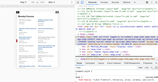
To make sure everything worked properly on tablets and mobile, I used BrowserStack and the ChromeDev tools.
Many of the community members used iPads, making the tablet version of the website crucial.
Learnings
Data-informed is sometimes better than data-driven
When we test for specific things, data doesn’t always provide the whole picture. For example, the Beyond the Classroom page was meant to encompass all extracurricular opportunities available to HILR members. However, tree test results suggested that many HILR members saw “Beyond the Classroom” as a catch-all term.
Beyond the Classroom seems to be a grabbag for anything that doesn't fit neatly into some other obvious category […] Is there a better name for it?
Tree Test Participant
My first inclination was to replace the phrase, but I received pushback from HILR staff. After some discussion, I brought up that tree tests provide little contextual information. I suggested using dropdowns on the main menu to give context to this section. After launch, visitors found Beyond the Classroom easy to use.
Outcome
My favorite part of this project was how it served purposes beyond academic needs.
Post-launch, HILR staff received great feedback from community members. Members loved the Courses page and the Quick Links. But my favorite piece of feedback was from the Zoom Help page:
“Zoraida, you can’t imagine how helpful this has been. Especially for our oldest members.”
HILR Staff Member
Members felt happy and relieved that they could quickly learn about how they could use Zoom. This tool was crucial for both attending class and connecting with friends and family during the pandemic.